[ad_1]

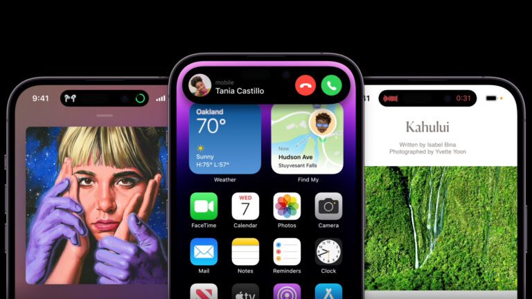
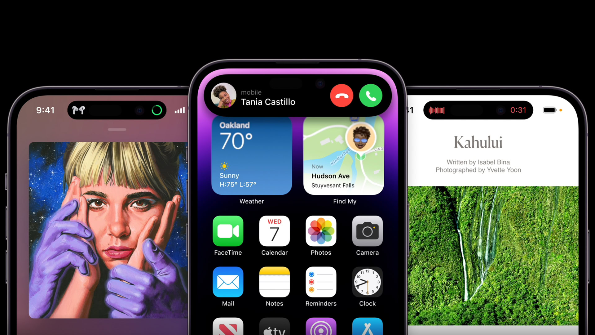
Apple’s iPhone 14 Pro models finally ditched the wide notch of prior models in favor of two cutouts dubbed the Dynamic Island. The two cutouts are actually bridged by software, and tapping the area allows you to view a bubble of information such as notifications, music playback controls, and more.
It certainly differs from Android’s take on display cutouts. But do you want a Dynamic Island feature on Android? We posed this question a couple of days ago, and here’s how you voted.
Do Android phones need a feature like Apple’s Dynamic Island?
Results
This was an extremely popular poll, garnering over 14,000 votes as of writing. It turns out that there wasn’t a runaway winner here, but 53.72% of respondents said they don’t think Android needs Apple’s Dynamic Island feature.
Reader comments supporting this stance point to Android devices having much smaller punch-holes (so there isn’t a need to “hide” the cutout with a software feature) and a better notification system. Some readers also noted that the location of the Dynamic Island would be a problem for large phones, forcing you to awkwardly reach for the top to activate it.
On the other hand, 46.28% of surveyed readers felt that Android indeed needed a Dynamic Island feature. At least one reader felt this would be nice to have in order to use the area around punch-hole cutouts.
Comments
- Cappuccino Cowboy: That’s actually pretty slick, the iphone implementation, I mean. But, if they just made it one big pill, there wouldn’t be a need for it at all.
So, it’s kind of like, they created a solution to a problem they never should’ve had in the first place. 🤷 Seeing an Android dev create the same feature, makes absolutely no sense and just makes them look petty. What purpose would it serve, that the standard icons don’t already? - Peeet: I may be alone with my tiny hands, but I never touch that part of the screen…seems like a PIA to open..
- Kevin Bradshaw: No. This is the least necessary thing for a android phone. In fact the useful aspects of it, like media play back, are already a thing your phone can do.
- Powsniffer0110: Not needed, but the option would be nice to have to utilize and coverup notches/hole punches!
- Face: Soon as I seen that I said we could easily add something like that in a mod or root this is why we choose Android we can do anything
- not me: I dont think it’s something that NEEDS to be ported over but, like most things Google stuffs into Android, I’m sure I’d enjoy it’s presence
- Joe Black: TBH, I do not see the appeal, it just looks … clumsy.
- Wowbagger: Imitation is the finest form of flattery. On the plus side, with an Android phone the bulk of the camera cutouts are really tiny, so the dead-space would actually be touchable and overall less visible. I see this as a win for everyone.
- Sir_Brizz: We don’t need it, we already have omnipresent notifications. Also, more devs should implement the floating pill like tracking live sports scores. That would be pretty nice for Uber.
- : I don’t care that companies copy from each other, in fact I love it! I use an iPhone and a Pixel and love it when features I like come to each phone. It’s a win-win for me.
[ad_2]